Yeah, sorry, you can't do anything with that cellphone video because it's in some stupid format, right? and yeah no your conversion software will convert it... into some special magical mp4 file that can be played by your player but not opened by your video editing software... especially if you're trying to use Ableton Live for video editing. Which you can do. It's great. Shut up. It's awesome. It can only open mp4s and movs if you have QuickTime installed and nobody bothers to document that but whatever, that's OK. It's software. Accountability. It has no meaning.
So anyway, give up on your encoder and just upload the offending video in its crazy format to Google Drive, or YouTube, and then rip it back out of the YouTube player using Firefox Video Download Helper.
Yet another classic instance of having to use software that's legal but in the process of getting shut down for enabling hacking and piracy, in order to do something that's totally legal, but made difficult by companies that want you to pay for your right to edit the videos that you yourself record using the camera in your phone... instead of just sharing it.
So, yeah, the solution is basically to share it, to nobody, then rip it, using software used almost exclusively for piracy, and then you can edit it. Don't be surprised if you can't even see the video clip when surfing your cellphone's hard drive from your PC while it's tethered. Maybe it'll be visible, maybe it'll be invisible. It's software. Literally half a person at Google cares what your experience is like with it. There's somebody around there that's just a pair of legs (no ears so they can't hear your usability problems).
Showing posts with label Google. Show all posts
Showing posts with label Google. Show all posts
Nov 14, 2013
Why our civilization needs better typography in email and websites
It's no wonder people don't want to do a lot of reading on the web. Of course, LCD screens are bright and exhausting for the eyes to look into, and we'll go down as the generation who lost its eyesight and reading habits to those weird old monitors (the ones we use now, I mean) that couldn't have colour without glowing. We're just starting to see e-readers (and their great screens that you actually have to illuminate with a light or something), gaining popularity, but people still read their emails in their web browsers, on their computers, and we'll keep doing it for awhile.
That's why it'd be nice if Google did something about this:
 That shouldn't be what my emails look like. I used to use Firefox for my emails just because it let me tell it to use fonts that I specify, so I could specify something nice. But that's a browser-wide setting that screws up every website, including gmail.
We need settings inside Gmail that let us say "look, I'm not into Arial as a paragraph font" - hey, it's a sound objection, from a typography theory standpoint.
I just want to sigh, because this comes from a problem that's been on the 'web for far too long: we are using sans-serif fonts for paragraphs because they used to look better on computers. And we're using point sizes that are too small. We as in web designers. Because it's hard to stand up to a creative director who doesn't ever have to read the text that they are making styling decisions about. I get that. But as designers, I feel like we have have an obligation to whip out a typography book here and there and say "look guys, let's think about readability." Not even legibility, but readability.
I don't even know what Hotmail looks like at this point, but if someone wants to link up a screenshot of what their email looks like, comment it up.
That's why it'd be nice if Google did something about this:
We need settings inside Gmail that let us say "look, I'm not into Arial as a paragraph font" - hey, it's a sound objection, from a typography theory standpoint.
I just want to sigh, because this comes from a problem that's been on the 'web for far too long: we are using sans-serif fonts for paragraphs because they used to look better on computers. And we're using point sizes that are too small. We as in web designers. Because it's hard to stand up to a creative director who doesn't ever have to read the text that they are making styling decisions about. I get that. But as designers, I feel like we have have an obligation to whip out a typography book here and there and say "look guys, let's think about readability." Not even legibility, but readability.
I don't even know what Hotmail looks like at this point, but if someone wants to link up a screenshot of what their email looks like, comment it up.


Nov 9, 2013
Why Google gave up on gradients - and why you should too
Google's logo has ended up in plain, solid colours:

It's beautiful, it's vivacious, and it renders up fast.
Their previous one was more typical of what we see online: it was more gradient-y.

And the further back you go in their logo's history, the more gradient-heavy the logo appears to be.
So ironically, the logo has gotten more and more efficient in terms of file size, even as users' access speeds have increased.
This is what happens with companies - as time goes by, they simplify their communications graphics because they're less worried about impressing their users with graphics and more concerned with impressing their users with speed. They also tend to realize, slowly, that sometimes simpler is better, even if it's less impressive to designers and creative directors.
We've also watched OS and productivity software, which isn't restricted by the same speed issues, become very gradient-heavy:

And we've watched it snap back in the opposite direction:

So when I'm evaluating a client's graphics situation, if I see a lot of gradients going on, I often advise them to play the tape to the end, realize that they're going to get rid of this excess visual baggage at some point, and choose the cheaper, more confident path of opting for simplicity from the outset.
It's not just about loading time - gradient-heavy designs take longer to compose, prototype, and implement. They're more finicky at every stage, often in ways that are impossible to explain to someone who doesn't write HTML and CSS.
If you feel like commenting, I'd love to hear about some other examples of this trend - there are so, so many, and I only included a couple in here. I'd also be curious to hear about other similar trends that people should consider, so that they can future-proof their designs a bit. It also raises the topic of how user interfaces and visual communications mature along with the projects that they represent, and that's something I want to explore a lot more!
It's beautiful, it's vivacious, and it renders up fast.
Their previous one was more typical of what we see online: it was more gradient-y.
And the further back you go in their logo's history, the more gradient-heavy the logo appears to be.
So ironically, the logo has gotten more and more efficient in terms of file size, even as users' access speeds have increased.
This is what happens with companies - as time goes by, they simplify their communications graphics because they're less worried about impressing their users with graphics and more concerned with impressing their users with speed. They also tend to realize, slowly, that sometimes simpler is better, even if it's less impressive to designers and creative directors.
We've also watched OS and productivity software, which isn't restricted by the same speed issues, become very gradient-heavy:
And we've watched it snap back in the opposite direction:
So when I'm evaluating a client's graphics situation, if I see a lot of gradients going on, I often advise them to play the tape to the end, realize that they're going to get rid of this excess visual baggage at some point, and choose the cheaper, more confident path of opting for simplicity from the outset.
It's not just about loading time - gradient-heavy designs take longer to compose, prototype, and implement. They're more finicky at every stage, often in ways that are impossible to explain to someone who doesn't write HTML and CSS.
If you feel like commenting, I'd love to hear about some other examples of this trend - there are so, so many, and I only included a couple in here. I'd also be curious to hear about other similar trends that people should consider, so that they can future-proof their designs a bit. It also raises the topic of how user interfaces and visual communications mature along with the projects that they represent, and that's something I want to explore a lot more!
Apr 27, 2013
ShiftEdit IDE: my new cloud-based Dreamweaver replacement?
I have been waiting for a good online HTML/CSS editor for way too long and it turns out I've been missing out because ShifeEdit is ready for our Dreamweaver-ish tasks. I've tried it out a tiny little bit and it hasn't disappointed me in any of the ways that other editors have. It's disappointed me in new and difficult-to-explain ways. But they're not bad.
Overall a great start and I'd certainly use it on a commercial product.
Check out ShiftEdit, the great new browser-based IDE
Overall a great start and I'd certainly use it on a commercial product.
Check out ShiftEdit, the great new browser-based IDE
Apr 25, 2013
Apr 21, 2013
Wow! Disabling the blog Feed disables Dynamic Views
If you want to use Dynamic Views in Blogger, which I recommend at least trying by the way, don't do what I did and "disable feeds." It will not warn you that your blog will basically go offline, showing a Blogger loading animation to anyone who visits the site.
That "other" panel in the Settings is dangerous.
Blogger Help: Dynamic Views - Google support article
That "other" panel in the Settings is dangerous.
Blogger Help: Dynamic Views - Google support article
Apr 13, 2013
Filtering Blogger posts using multiple labels
I've been wondering for some time now about how to filter a post feed using combinations of labels, like if I want articles about Usability that are also about Windows. I've been thinking of categorizing each of my posts according to which audience they're written for, so that people can filter my other categories by the audience as well.
I've seen this in user interfaces before, but I need to learn the terminology so I can continue my research.
In the meantime, I discovered an easy point of access: The URL itself. Google built some logic into these URLs:
So this link will bring up a feed of articles that have a combination of three different labels
All I need to do is find some Javascript to make the label buttons correspond to what's in the URL, and also affect it when they get toggled on or off.
For the interface, I want to essentially have the functionality of groups of radio buttons and checkboxes that we see in desktop operating systems and advanced searches.
I don't feel like this is a big enough task to require advanced javascript libraries. I just need to be able to add and remove a series of labels from the URL.
I've seen this in user interfaces before, but I need to learn the terminology so I can continue my research.
In the meantime, I discovered an easy point of access: The URL itself. Google built some logic into these URLs:
So this link will bring up a feed of articles that have a combination of three different labels
All I need to do is find some Javascript to make the label buttons correspond to what's in the URL, and also affect it when they get toggled on or off.
For the interface, I want to essentially have the functionality of groups of radio buttons and checkboxes that we see in desktop operating systems and advanced searches.
I don't feel like this is a big enough task to require advanced javascript libraries. I just need to be able to add and remove a series of labels from the URL.
Mar 28, 2013
Google does the right thing about the Blogger Nav Bar
It's a time for rejoicing, not only in less sketchy CSS code needed but also in the reaffirmation of Google's intentions for us: it wants us to use its software, even if others don't know we're using it.
So now, let us bid farewell to all that is old and broken:


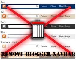

Now, we can chill out and work with this:

So now, let us bid farewell to all that is old and broken:
Now, we can chill out and work with this:
May 25, 2010
Treating Google Maps/Local Right
Whether you know it or not, Google is finding your business. And it's placing it on a map. Maybe it'll be obvious, maybe it'll be findable, maybe it'll be searchable, and maybe it'll be in the right place.
Here's how you can get your location to appear properly in Google Maps searches.
Here's how you can get your location to appear properly in Google Maps searches.
- put your full address, starting with your or your businesse's name, somewhere on your site
- a page called "contact" is fine
- on each page in the footer is even better
- find yourself in a Google Maps search and "ownerize" your listing with google (I'll cover this later)
- list your own address, with cross-street if possible, in whatever business listings, comments on blog posts, and user forums come up when you do a google search that your business should come up for
- add photos of your business to Google Maps or other online tools, marked with your address
Here's how to prevent your business from showing up properly in Google Maps:
- use an address description that confuses Google Maps when you search it
- your address string should take Google Maps to your address, on the correct side of the street, and you can use Maps to test this
- keep the address and name of your business too separate
- put your address in a Flash document - it should be in a visible part of the HTML
Once you've got an incorrect listing on Google Maps, it can be hard to change it. So make sure to establish your location right from the get-go, and don't be afraid to make new points on the map if the old ones are wrong - it's easier than trying to move them and whichever is flossed-out more will get clicked on. I'll cover flossing out your google maps listing another time.
May 12, 2010
Embeddeding Google Maps in Your Website
Here's the first things I noticed about embedding Google Maps. I'm not talking about the API version, I'm talking about the Paste HTML to embed in website thing in the  Link thing on the top-right of any maps.google.com map.
Link thing on the top-right of any maps.google.com map.- The maps themselves easier than you think to put together.
- You can add your own markers to the maps, but they have cool ones too.
- Use the Google-supplied ones if you can, because sometimes custom buttons can screw with the information overlay bubbles' appearance in the map, in Webkit browsers like Safari and Chrome. You know the bubbles I'm talking about right? The ones that come up when you click on a marker, on the map.
- Internet Explorer and Firefox don't seem to have this problem.
- In the last year, Safari and Chrome are the small but growing markets.
- The customized, embeddable maps don't catch the scroll wheel on your mouse as a zoom-in-out thing, so it doesn't interfere with scroll button scrolling, like the API version of Google Maps on the Fido site does.
- Seems like you can just replace both the height and width in the tags with 100%, and it fits inside whatever container you throw it in. Or you can restyle it with CSS using the ID in the tag. It's pretty easy to mess with.
So now I'm experimenting with:
- Fixing the custom marker / rounded corners on overlay display bug I've encountered. T
- Coming up with a better name for the bug. Both so I can search about it and write about it. All I get is rounded corners in CSS tutorials. Whatever, I can do that with the rounded corner thing. I don't need .gifs for that anymore.
- Removing some of the map options with some display: none; CSS. I just need to find the selector, or make one. But I can't seem to get a consistent response from it in Webkit's own DOM inspector... I think because the map is protected by Javascript, which I don't understand well enough.
Any help would help. A javascript buddy would also help. I keep getting projects that need Javascript and they have the money for it... but not the money for my terrible, CSS/Usability guy trying to do scripting effort.
Subscribe to:
Posts (Atom)