Yeah, sorry, you can't do anything with that cellphone video because it's in some stupid format, right? and yeah no your conversion software will convert it... into some special magical mp4 file that can be played by your player but not opened by your video editing software... especially if you're trying to use Ableton Live for video editing. Which you can do. It's great. Shut up. It's awesome. It can only open mp4s and movs if you have QuickTime installed and nobody bothers to document that but whatever, that's OK. It's software. Accountability. It has no meaning.
So anyway, give up on your encoder and just upload the offending video in its crazy format to Google Drive, or YouTube, and then rip it back out of the YouTube player using Firefox Video Download Helper.
Yet another classic instance of having to use software that's legal but in the process of getting shut down for enabling hacking and piracy, in order to do something that's totally legal, but made difficult by companies that want you to pay for your right to edit the videos that you yourself record using the camera in your phone... instead of just sharing it.
So, yeah, the solution is basically to share it, to nobody, then rip it, using software used almost exclusively for piracy, and then you can edit it. Don't be surprised if you can't even see the video clip when surfing your cellphone's hard drive from your PC while it's tethered. Maybe it'll be visible, maybe it'll be invisible. It's software. Literally half a person at Google cares what your experience is like with it. There's somebody around there that's just a pair of legs (no ears so they can't hear your usability problems).
Showing posts with label bugs. Show all posts
Showing posts with label bugs. Show all posts
Apr 21, 2013
Wow! Disabling the blog Feed disables Dynamic Views
If you want to use Dynamic Views in Blogger, which I recommend at least trying by the way, don't do what I did and "disable feeds." It will not warn you that your blog will basically go offline, showing a Blogger loading animation to anyone who visits the site.
That "other" panel in the Settings is dangerous.
Blogger Help: Dynamic Views - Google support article
That "other" panel in the Settings is dangerous.
Blogger Help: Dynamic Views - Google support article


Apr 15, 2013
Apple changes their browser prefs defaults after hacker attacks?
Apple's Cupertino campus actually got hacked, which is amazing, and it's sad that Java browser plugins were the weak point in their security. Sad but not surprising.
But their decision to change the default settings on their Macs is even more amazing! Shipping browsers with Java plugins turned off? Don't mix this up - we're talking Java, not Javascript, but still, that's pretty amazing.
This means, all of a sudden, there's a wall between Java and Mac users that wasn't there before, and this is something we'll probably see across operating systems in the next little while. And this is a great thing because in-browser Java has always seemed super sketchy to me.
Mar 28, 2013
Google does the right thing about the Blogger Nav Bar
It's a time for rejoicing, not only in less sketchy CSS code needed but also in the reaffirmation of Google's intentions for us: it wants us to use its software, even if others don't know we're using it.
So now, let us bid farewell to all that is old and broken:


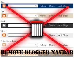

Now, we can chill out and work with this:

So now, let us bid farewell to all that is old and broken:
Now, we can chill out and work with this:
Jun 21, 2012
Exactly what I think of Google Web Fonts
It's a great selection, and it's organized real nicely. You can enter some text, look through a ton of fonts, test them out in different ways, even see how they'll look together.
The fonts are high-quality. Some of them are kind of stupid, but none of them are garbage or glitchy.
Watch out: get too many fonts added to your collection and it may crash, and then you're back to square one. You can "back up" your collection as you go using your Copy and Paste with the Bookmark Collection feature. The feature is also useful for sending someone your list as a link. What a boon for client relations!
The fonts get served up fast when you embed them. And they make it easy to do it in a few different ways, to suit the need.
The thing I hate most about the whole thing is having to see the sentence "Grumpy wizards make toxic brew for the evil Queen and Jack" instead of just the alphabet, as a demo sentence, but it's good to be prodded into pasting in my own sentence.
So, once again, Google dominates because they made it (somewhat) usable, they didn't get ahead of themselves, and they didn't try to over-stylize a tool, like Typekit did. They made it easy to download the fonts. They basically found out what designers needed. I'd say, other than the instability, the biggest failing is that they anticipated the process of font selection too closely.
The fonts are high-quality. Some of them are kind of stupid, but none of them are garbage or glitchy.
Watch out: get too many fonts added to your collection and it may crash, and then you're back to square one. You can "back up" your collection as you go using your Copy and Paste with the Bookmark Collection feature. The feature is also useful for sending someone your list as a link. What a boon for client relations!
The fonts get served up fast when you embed them. And they make it easy to do it in a few different ways, to suit the need.
The thing I hate most about the whole thing is having to see the sentence "Grumpy wizards make toxic brew for the evil Queen and Jack" instead of just the alphabet, as a demo sentence, but it's good to be prodded into pasting in my own sentence.
So, once again, Google dominates because they made it (somewhat) usable, they didn't get ahead of themselves, and they didn't try to over-stylize a tool, like Typekit did. They made it easy to download the fonts. They basically found out what designers needed. I'd say, other than the instability, the biggest failing is that they anticipated the process of font selection too closely.
Apr 4, 2012
Feb 28, 2012
Web Links from Non-Web Apps
When a link on a website takes the user to another site, or opens a new window or tab or something, it's best practice to mark that link, so that users understand that it's different from other links on the site.
The same is true for desktop applications. When a menu item opens a web browser, it's doing something that other menu items don't do, and that users should know about before clicking on the item:
The same is true for desktop applications. When a menu item opens a web browser, it's doing something that other menu items don't do, and that users should know about before clicking on the item:
- it switches programs unexpectedly
- this initially makes the user think they accidentally switched programs
- so they'll usually try to switch back to it from the blank page or loading browser
- they'll often try the command again
- it can take several tries before the user realizes the program is operating as expected
- they may also think that the program they were in just has crashed or experienced an error
- if the web browser isn't active, it gets launched
- this can look like the beginnings of a crash report, reinforcing the user's suspicion of a program error
- the first thing a user thinks is "I have accidentally launched my browser" or "some browser window just spontaneously spawned another window, which is always a bad sign"
- a new browser tab or window is created, obscuring what was there before
- if users switch back to the browser, they won't immediately recognize it as the browser window they had open
- they tend to keep looking for the now-hidden tab in other browser windows
- this may seem like a stretch, but users are blind to details which they don't think have changed, and especially things that they didn't initiate
Feb 10, 2012
The new one is slower!
Here's an easy usability mistake to make: you upgrade a thing, but the new version is a bit slower to load or use, and so you see a decrease in usage and people wondering how to switch back!
This is why realistic speed measurements need to be built into each round of testing, and a round of testing with each revision cycle. It's the kind of research you have to be able to do quickly to get away with.
This is why realistic speed measurements need to be built into each round of testing, and a round of testing with each revision cycle. It's the kind of research you have to be able to do quickly to get away with.
Feb 27, 2011
System Resume Promise Resurfaces
"If you’ve ever restarted your Mac, you know what’s involved."
Apple is promising it to us again: You can basically turn your computer off, and when you come back you can pretty much instantly resume what you're up to. Things will reappear, maybe you'll need to enter your password, and there you go.
Microsoft has also been promising this for years, and various Linux distributions have been making similar promises.
What computer users get, however, typically falls short when certain problems become common:
Apple is promising it to us again: You can basically turn your computer off, and when you come back you can pretty much instantly resume what you're up to. Things will reappear, maybe you'll need to enter your password, and there you go.
Microsoft has also been promising this for years, and various Linux distributions have been making similar promises.
What computer users get, however, typically falls short when certain problems become common:
- System resume fails, crashing the computer.
- Resume takes almost as long as startup.
- Users aren't sure whether they should "hibernate" or "sleep," because they don't understand the difference.
- The system is unstable after resume.
- If the computer doesn't automatically switch to hibernation from sleep mode when losing battery life, data may be lost when the power finally runs out.
Feb 11, 2011
Why NOT to Have a Website
For small business people and artists, maintaining a website, especially a traditional website, and especially a really slick one, is a big task to add to the to-do list. And even with a lot of initial effort and the regular content updates that make a site worthwhile, it's still not enough - in order to stay fresh and functional as things change, it'll need to be changed and redesigned from time to time. Most people have an easier time changing their signage and business cards than their website, and they end up wondering whether it's helping or hurting their goals.
For users who clearly don't need a custom site, I recommend blogging instead, because it serves most people's needs and doesn't cost them much. Web designers (like me) who previously had a hard time offering good value to small businesses are now finding ways to visibly re-brand Wordpress, Blogger and Tumblr accounts, making them more appealing to clients who don't like the idea of geeky logos appearing on their sites.
Most people, however, don't need to do any web publishing. They just need the equivalent of a business card and a sign - online. They need to communicate the basic format of what they're offering, whether it's great sandwitches or great dog photos, and how they can be contacted.
For people using the internet to find products and services, what matters most is being able to find the information they're looking for, and assess how fresh and accurate it is. They'll do a search, check whichever sources of information look promising, and then choose among them depending on which seems most accurate.
Let's examine a typical internet task:
- Search for store name + city name
- Scan the top results that look related, and open the official site, as well as a community business listing, in new tabs.
- Since the business listing and the official site list different hours, get phone number off official site, as it's more likely to be accurate.
At this point, having to make a phone call for information that should be available online may derail the task, especially if a competing business offers information with a recent date on the content. - The business has to deal with another extra phone call.
This is pretty typical on the internet. This business could improve their initial interaction with the customer in three ways:
- Maintaining awareness of their own online presence, so they knew where their information would need to be updated, and take control over their third-party community listing, and
- Indicating when the information was last changed, assuring web users that the information has been recently approved by management.
- Providing a calendar of any closure dates - statutory and bank holidays for example.
Here are some advantages of using 3rd-party listings, social networking and media sharing sites instead of or in addition to an official website.
- Users trust and understand them already.
- It's easy to make it clear that the information is official and up-to-date.
- They're maintained by large companies with research & development budgets, so they can worry about keeping them up-to-date, on their dime.
- Even if their site is tacky, it only reflects on them, not your business.
- Listings sites index very well in search engines - usually better than private websites.
- They usually allow for user comments, which enhances credibility.
- They're well-supported because of their size, so if you need help with something, it's easy to find the answers.
- It's more reliable - less likely to go offline, get attacked, be accidentally blocked by Google, or suffer from traffic overload.
- Businesses benefit by being listed together, providing a context of competitive representation that attracts people's attention, just like stores benefit from themed districts in a city.
- It's much easier to prepare and present the content, because each listings or sharing site has a format that's easy to follow.
- Maintaining several different listings and accounts might seem like a repetitive hassle, but each of them serves a different kind of community in a way that suits them. Each site is an opportunity to present information in a way that maximizes that format and engages that audience.
Some online directories, such as online yellow pages, are open-ended, and some are specific to an industry or a niche, like TripAdvisor.
The real meat of engaging with one's online presence is researching these opportunities, and they're different for everyone and every business. With a little research, anyone can find out where they belong online - and then it's just a matter of keeping things up-to-date, responding to comments, and continuing the research as the landscape changes in reaction to their efforts.
So as usual, the message is, you don't need to spend a bunch of money or waste a bunch of time to look good and get things done on the 'net. It just takes a bit of patience, like everything else about doing business.
Even if you are maintaining profiles on 3rd-party sites, it's nice to have an official site to "anchor" and connect all the online profiles. And it's a good reason to develop an internet presence before creating a private website. But if it takes time away from responding to comments and keeping your profiles and listings fresh, and especially if it doesn't contain content that's not available elsewhere and couldn't be presented better elsewhere, then it's slowing things down.
May 12, 2010
Embeddeding Google Maps in Your Website
Here's the first things I noticed about embedding Google Maps. I'm not talking about the API version, I'm talking about the Paste HTML to embed in website thing in the  Link thing on the top-right of any maps.google.com map.
Link thing on the top-right of any maps.google.com map.- The maps themselves easier than you think to put together.
- You can add your own markers to the maps, but they have cool ones too.
- Use the Google-supplied ones if you can, because sometimes custom buttons can screw with the information overlay bubbles' appearance in the map, in Webkit browsers like Safari and Chrome. You know the bubbles I'm talking about right? The ones that come up when you click on a marker, on the map.
- Internet Explorer and Firefox don't seem to have this problem.
- In the last year, Safari and Chrome are the small but growing markets.
- The customized, embeddable maps don't catch the scroll wheel on your mouse as a zoom-in-out thing, so it doesn't interfere with scroll button scrolling, like the API version of Google Maps on the Fido site does.
- Seems like you can just replace both the height and width in the tags with 100%, and it fits inside whatever container you throw it in. Or you can restyle it with CSS using the ID in the tag. It's pretty easy to mess with.
So now I'm experimenting with:
- Fixing the custom marker / rounded corners on overlay display bug I've encountered. T
- Coming up with a better name for the bug. Both so I can search about it and write about it. All I get is rounded corners in CSS tutorials. Whatever, I can do that with the rounded corner thing. I don't need .gifs for that anymore.
- Removing some of the map options with some display: none; CSS. I just need to find the selector, or make one. But I can't seem to get a consistent response from it in Webkit's own DOM inspector... I think because the map is protected by Javascript, which I don't understand well enough.
Any help would help. A javascript buddy would also help. I keep getting projects that need Javascript and they have the money for it... but not the money for my terrible, CSS/Usability guy trying to do scripting effort.
Nov 13, 2007
The Mars exploration site's got problems? Holy moly!
It's hard to believe that somebody would make this kind of mistake on the Mars Exploration website, but yeah, the flash thing totally doesn't do anything when you click one of the "click to view" something links. This shows how even when loads of money is thrown at a web design job, massive problems can still slip through the cracks, without proper testing. In this case, the cheapest of usability tests or a heuristic audit would have revealed the problem.
The moral of the story? Don't make it slick if you can't make it click.
The moral of the story? Don't make it slick if you can't make it click.
UPDATE: Sometime between 2011 and 2013, this problem was solved, because the interactive thing I was referring to was removed. It was replaced with a virtual tour that's so ghetto, you'd have to travel with it back in time at least a decade to find someone who'd be impressed by it. But it does seem to work.
Subscribe to:
Posts (Atom)